In your control panel, go to Storefront > My Themes, and click the blue "Customize" button to launch Theme Editor.
In the left hand column of the Theme Editor, click the panel labelled 'Buttons & Icons'.
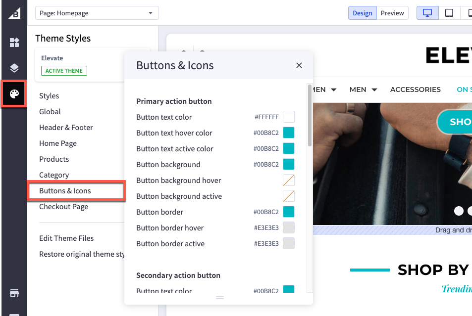
Primary action button
| Button text color | color of the text inside the button |
| Button text hover color | color of the text in the button when you hover a cursor over it |
| Button background | color of the button behind the text |
| Button background hover | color of the button behind the text when you hover a cursor over it |
| Button background active | color of the button behind the text when you click on it |
Secondary action button
| Button text color | color of the text inside the button |
| Button text hover color | color of the button behind the text |
| Button text active color | color of the text in the button when you click on it |
| Button border | color of the line around the button |
Tertiary action button
| Button background | color of the “sort by” filter selector/drop-down |
| Button arrow icon | color of the arrow in the “sort by” filter selector/drop-down |
Disabled button
| Button text color | color of the text inside the disabled button |
| Button background | color of the button behind the text |
| Button border |
color of the border around the button |
Icons
| Social media icon | color of social media icons in the footer |
| Social media icon hover | color displayed when the cursor hovers over a social media icon |
| Star review icon (full) | color of the star icons that are empty in a star rating display |
| Star review icon (empty) | color of the star icon rating that gets counted |
| Increase/decrease button | color of the quantity change buttons |
Checkboxes and radio buttons
| Checkbox and radio icon | color of the checkmark on checkboxes, or the dot on radio buttons |
| Button background | color of the box behind the check mark or radio dot |
| Button border | color of the border around the checkbox/radio button |
