In your control panel, go to Storefront > My Themes, and click the blue "Customize" button to launch Theme Editor.
In the left hand column of the Theme Editor, click the panel labelled 'Checkout'.
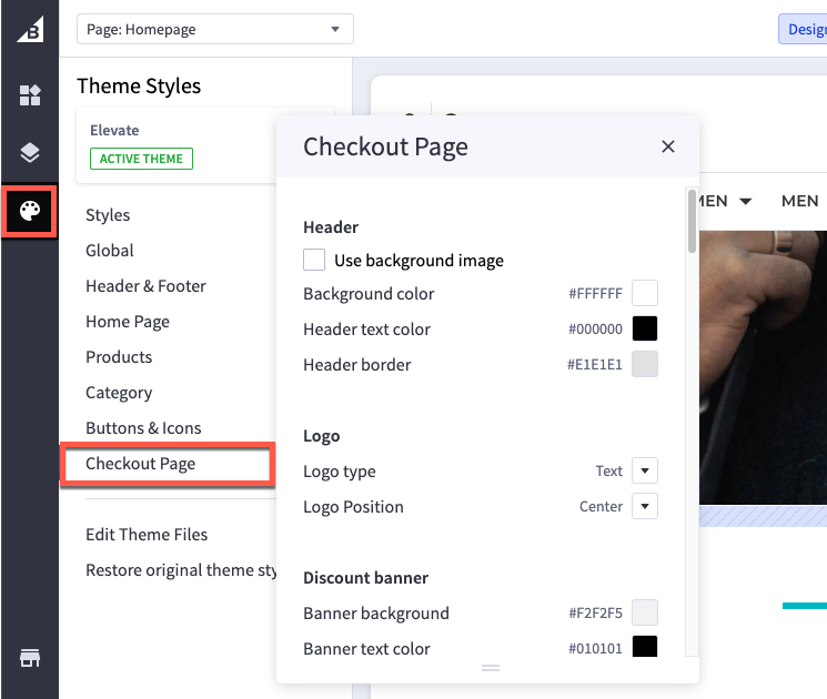
Header
| Use background image | check this box to upload an image to display behind the logo. Recommended dimensions are 1000 x 400 pixels. |
| Background color | color that appears behind the logo |
| Header text color | color of header text if using a text logo |
| Header border | color of the border around the header |
Logo
| Logo type | Add an image for your logo. By default, it will inherit the settings from the Logo tab. |
| Logo position | moves the logo to the left, center or right side of the header. |
Discount banner
| Banner background | color of Automatic Promotion notifications (set up in Marketing) |
| Banner text color | color of the text in Automatic Promotion notifications |
| Banner icon |
color of the icon that appears in Automatic Promotion notifications |
Order summary box
| Box background | color of the order summary box background |
| Box border | color of the border around the order summary box |
Checkout steps
| Icon background | color of the circle behind the icon/number |
| Icon border | color of the border of the circle around the icon/number |
| Icon text color | color of the icon/number in the step |
Headings
| Heading 1 font family | font face for h1 text |
| Heading 1 text color | color of h1 text |
| Heading 2 font family | font face for h2 text |
| Heading 2 text color | color of h2 text |
Body
| Page background | color of the page background |
| Focus color | color of the focused/selected field on the checkout form |
Body text and links
| Body text font family | font face for the text that appears on the checkout page |
| Body text color | color of the text that appears on the checkout page |
| Secondary text font family | font face of text that is not a title, label or informational text |
| Secondary text color | color of text that is not a title, label or informational text |
| Link font family | font face for text links that appear on the checkout page |
| Link color | color for text links that appear on the checkout page |
| Link hover color | color of text links when you hover a cursor over it |
Primary action button
| Button text font family | font face for buttons |
| Button text color | color of the text inside these buttons |
| Button text hover color | color of the text in the button when you hover a cursor over it |
| Button text active color | color of the text when the button is clicked. This usually displays very quickly, and may not appear in all browsers |
| Button text disabled color | color of the text when the button |
| Button background | color of the button behind the text |
| Button background hover | color of the button behind the text when you hover a cursor over it |
| Button background active | color of the button behind the text when you click on it |
| Button background disabled | color of the button behind the text when disabled |
| Button border | color of the line around the button |
| Button border hover | color of the line around the button when you hover a cursor over it |
| Button border active | color of the line around the button when you click on it |
| Button border disabled | color of the line around the button when disabled |
Secondary action button
| Button text font family | font face for buttons |
| Button text color | color of the text inside these buttons |
| Button text hover color | color of the text in the button when you hover a cursor over it |
| Button text active color | color of the text when the button is clicked. This usually displays very quickly, and may not appear in all browsers |
| Button text disabled color | |
| Button background | color of the button behind the text |
| Button background hover | color of the button behind the text when you hover a cursor over it |
| Button background active | color of the button behind the text when you click on it |
| Button background disabled | color of the button behind the text when disabled |
| Button border | color of the line around the button |
| Button border hover | color of the line around the button when you hover a cursor over it |
| Button border active | color of the line around the button when you click on it |
| Button border disabled |
color of the line around the button when disabled |
Form input fields
| Label text color | color of the form labels that appear above text boxes or product option selections |
| Field text color | color of text that appears inside a text box or drop-down menu |
| Field placeholder text color | color of example text that appears inside a text box or drop-down menu before the user starts typing |
| Field error text color | color of the error label text when a user attempt to submit the form without completing all required fields |
| Field background | color that appears behind the text in a drop-down menu or text box |
| Field inner shadow | color of the shadow next to the field border |
| Field border | color of the border around drop down menus, text boxes and rectangle multiple-choice buttons |
| Checkbox button background | color of checkboxes and payment method indicator |
Form checklist
| Background color | color of the background for payment methods |
| Form background | color of the active/selected payment method |
| Form header text color | color of payment method name text (if not a logo) |
| Form border color | color of the borders around payment methods |
Loading toaster
| Toaster background | color of behind the text on the loading notification |
| Toaster text color | color of the text on the loading notification |